
The coveted Esprit neon sweaters, the gravity-defying ’80s hair, the shoulder pads, the ’90s grunge phase (complete with giant Doc Martens), rollerblades, and Melrose Place marathons — yep, I lived through all of it. And just like fashion, home design trends always find their way back around. I mean, I never thought I’d see the day I’d be wearing flare jeans again… but here we are.
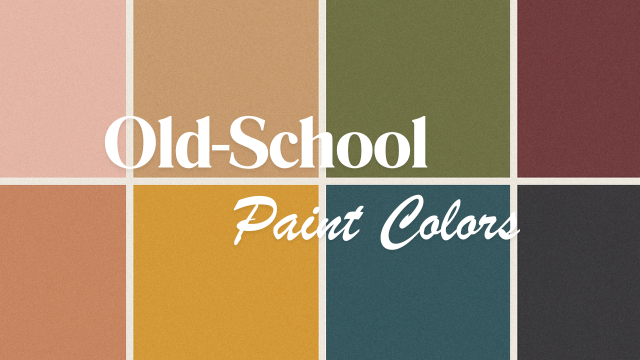
And paint is no exception. The team over at Real Simple recently rounded up some of the most iconic shades from the past century that are officially back in the design spotlight — and they’re not just nostalgia for nostalgia’s sake. These colors are richer, moodier, more intentional, and they’re proving that “old” can feel incredibly fresh in a modern home.
What I loved about their roundup is how it reminds us that paint isn’t just about color — it’s about mood, memory, and storytelling. Each decade’s palette reflects what was happening in the world at that time:
1950s pinks were all about post-war optimism and the promise of a brighter future.
1970s earth tones reflected a growing connection to nature and the back-to-basics movement.
1980s bolds screamed self-expression, confidence, and individuality.
1990s moody neutrals mirrored a shift toward minimalism and a more introspective era.
And now? Those same shades are being reimagined in ways that feel cool, sophisticated, and entirely 2025. It’s proof that design is cyclical — and that a well-chosen paint color can completely transform how a space feels, even decades later.
So before you imagine what these shades could do in your own space, let’s take a little trip through time and look at how each decade’s most beloved hues are getting a second act
1950s: Optimistic Pinks With a Grown-Up Twist
The ’50s were all about optimism — pastel kitchens, chrome appliances, and a deep belief that the future was bright. And no color captured that better than pink. While you might not be racing to install a bubblegum bathroom suite, today’s reimagined shades — like Farm-Fresh Eggs and Rosy Sandstone — give you the same charm without the kitsch.
Soft, dusty, and sophisticated, these pinks feel modern and timeless at once. They pair beautifully with warm browns, soft whites, and natural textures, bringing a subtle warmth and optimism into a space without overwhelming it.
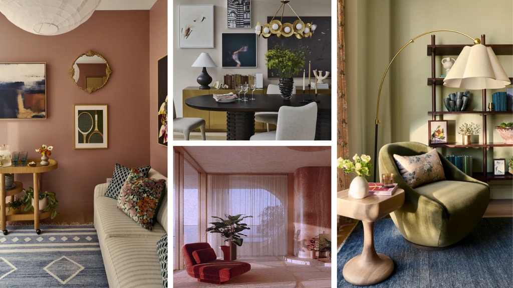
1970s: Earthy, Grounded, and Effortlessly Cool
The ’70s had their fair share of questionable choices (looking at you, shag carpeting), but they also gave us one of the most enduring design palettes ever: rich earth tones. Inspired by the back-to-nature movement, these hues are making a comeback in a way that feels fresh and refined.
Try bronzy neutrals like Crumbling Cork for a grounded, organic feel, or soft sages like Sweet Clover for a more elevated spin on vintage green. And if you’re ready to go bold, Warm Eucalyptus — Valspar’s 2026 Color of the Year — channels that decade’s soulful vibe with a modern, silvery twist.
Pro tip: These tones look incredible with natural materials — think wood, stone, and leather — for a space that feels rooted and timeless.
1980s: Fearless, Fun, and Unapologetically Bold
The ’80s were loud — and we loved it. Big hair, bold fashion, neon accents… and yes, those shoulder pads that made us feel invincible. It was a decade of individuality and maximalism, and that same spirit is creeping back into design.
While we’re (thankfully) leaving behind some of the more chaotic color combos, bold jewel tones and dramatic accents are having a serious moment. Think a deep teal statement wall, a splash of fuchsia in a powder room, or a bold black-and-white contrast that instantly energizes a space.
This is where you get to have fun — these shades are all about confidence and creativity. A little goes a long way, but even the smallest dose of ’80s color packs major personality.
1990s: Moody, Minimalist, and Forever Chic
After the boldness of the ’80s, the ’90s brought a collective deep breath — and the color palette followed suit. We swapped neons for neutrals, shiny for subdued, and embraced moodier, more introspective shades.
Colors like Daybreak, a soft greige, set the tone for minimalist interiors that still feel warm and livable. Berry Brandy — that deep, moody burgundy — adds drama and sophistication without overwhelming. And Night View, a rich, inky blue, pairs perfectly with modern neutrals for a look that’s timeless, versatile, and a little bit edgy.
These shades are proof that subtle doesn’t mean boring — they’re perfect for creating layered, livable spaces with just the right amount of depth.
Final Thought
The colors we choose for our homes are more than just aesthetic choices — they’re emotional ones. They connect us to a moment in time, spark memories, and shape how a space feels the second you walk through the door. And just like that favorite pair of flares you swore you’d never wear again… sometimes the past deserves a second chance.
Explore all the vintage-inspired shades and designer tips in the full article from Real Simple here: 8 Old-School Paint Colors Making a Triumphant Return.
Subscribe and hit the notification bell over on The New Home Experts Las Vegas YouTube Channel so you don’t miss it.
Work with an expert!
GET THE LATEST COMMUNITY NEWS AND UPDATES VIA EMAIL AND TEXT
[email protected] | 702-335-4779
www.jennifergraffrealtor.com
JOIN OUR NEWSLETTER
Check out this article next